Why we love it:
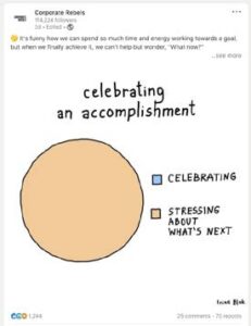
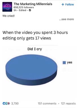
Here we see perhaps the silliest form of graph gag in action – the ‘single answer’ pie chart. This one works not just because it subverts our expectation that a pie chart is usually composed of multiple segments, but also because it expresses a Relatable Pain that clearly resonates with the Marketing Millennials’ audience: “I spend hours on content, only for it to flop.” Ironically, we imagine this post took minutes to create, at most…
What you can learn from it:
Graph gags go down a storm on LinkedIn, where audiences are used to seeing visualisations of data – meaning there’s a readymade expectation for you to subvert when your data turns out to be a joke. You can use the graph gag formats you get in Brands Against Mundanity Monthly, as well as experiment with silly, ‘single answer’ pie chart gags like this.