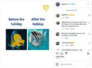
Why we love it:
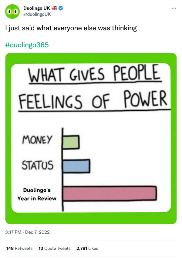
We love graph gags! This one doesn’t reinvent the wheel (in fact it uses a longestablished template), but it was well timed. Duolingo used a joke to join the conversation their audience was already having on Twitter (comparing their end of year stats reports).
What you can learn from it:
Your subscription gives you bar chart formats like this one every month. BUT – where Duolingo can get away with a somewhat self-congratulatory punchline because their audience is genuinely passionate about their Year in Review – you’ll need to double-check that your punchlines reflect your audience’s genuine relatable truths, and not just what you wish they felt.
Also – note how the green border is a quick and easy way to make this recycled graph gag feel like fresh branded content.