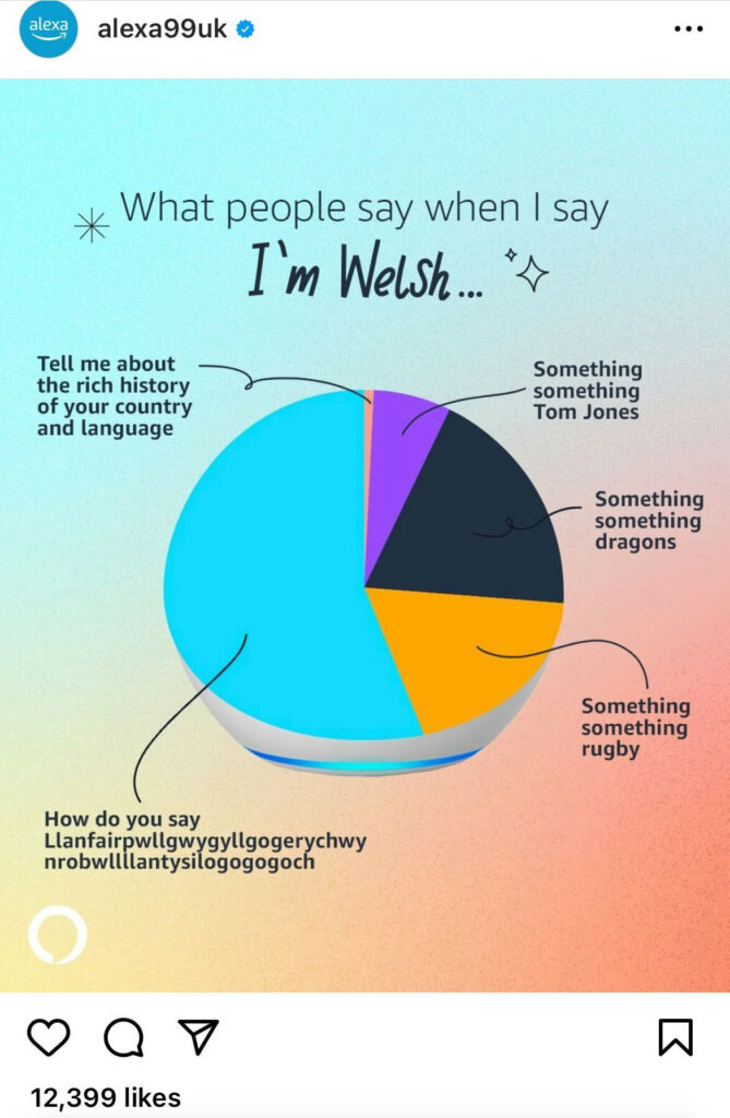
Why we love it:
Weird design choice where they’ve tried to make a pie chart look like an Echo speaker aside… this is a solid, scroll-stopping graph gag that uses the audience’s nationality as the starting point for broadappeal relatability. Those who are Welsh will relate to having heard these phrases, while people of other nationalities in the UK will happily admit to having said them.
What you can learn from it:
Why not steal the title format for your own pie chart? “What People Say When I’m X”, (where X = your audience). Now all you have to do is populate the pie segments with 3-5 phrases that your audience will have heard often. Although a word of warning: steer clear of anything around nationality / ethnicity / religion, unless you are 110% confident you’re not being offensive!